TL; DR Sunday #4
Welcome stranger to the TL; DR Sunday #4, hope you had an amazing week! So go grab something to drink and eat and let us dive in!
Some time ago I participated in Michal Malewicz’s daily challenge. When I was doing it, I thought it would be cool, to make some of the wireframes in the same style. So I can build something from it later on. The time has come!
I always wanted to make a banking app/website, no idea why. But why the hell not right?
I would lie that this was an easy one.
I’ve done a lot of renders for this one… So now we can wrap it up and call it a day! That’s it, thank you.
Nah, just kidding, it wouldn’t be me if I didn’t go a little further with this fun concept I had in my head. So let’s start at the beginning. PureRef!
That’s right. For 99% of projects I do, I use PureRef, it’s an amazing mood board tool. If you haven’t tried it, I highly recommend it.
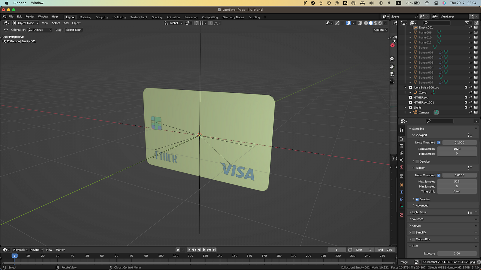
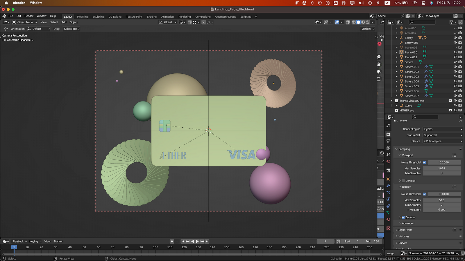
Once I feel like I’m starting to get the right idea of what I want to create, I move to Blender and start working on the composition.
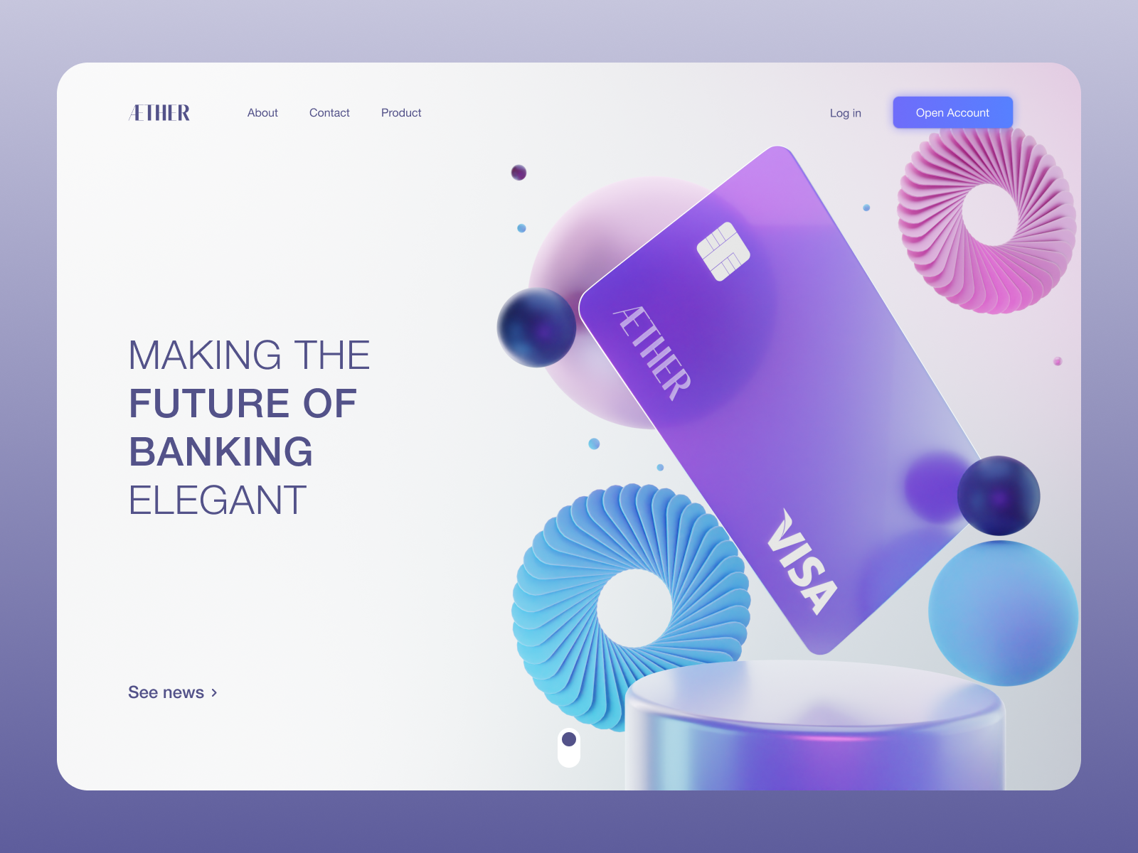
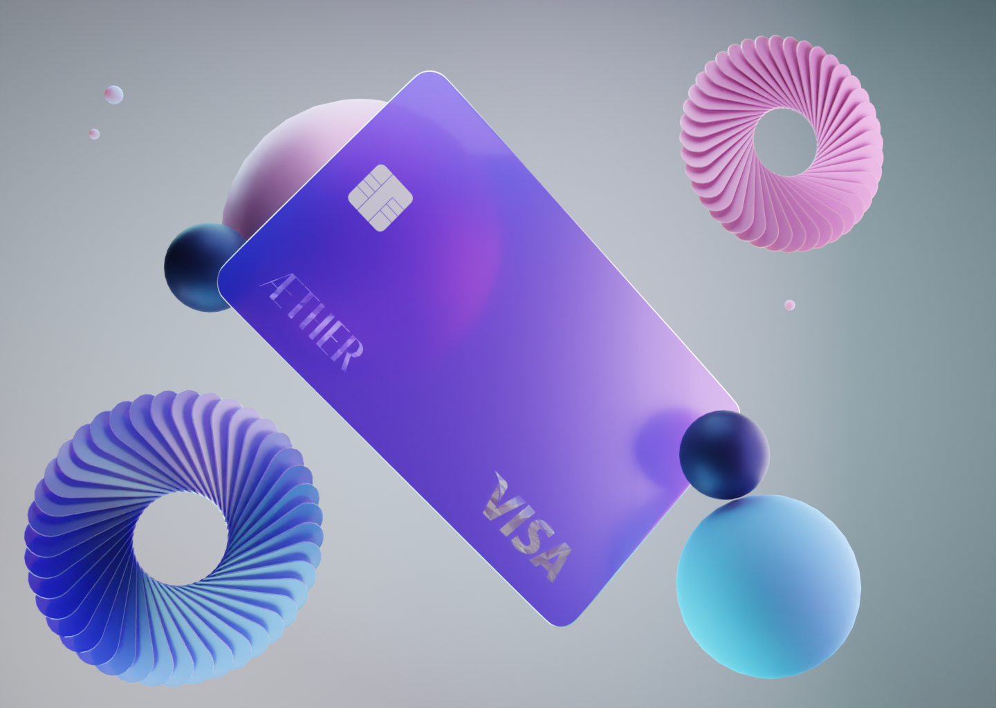
I started with the most important element of the design. The credit card!
Keep it simple
It’s made out of one shape. Plane. The card is extruded plane with beveled corners and the same goes for the chip.
After that, it was time for the smaller things on the card. So, I went to font share and found a font I liked for the logo. After that, I imported it into Blender to customize it a little.
Here’s a quick tip for importing logos into Blender. You take the design you like and export it in .svg format and then import it into Blender. This way you can have any kind of 2D illustration in the 3D space.
After I was happy with my card, I added some simple abstract elements to fill the scene.
You guessed it, it’s another plane! And sphere. It’s important to learn to build from simple objects. Can’t stress this enough.
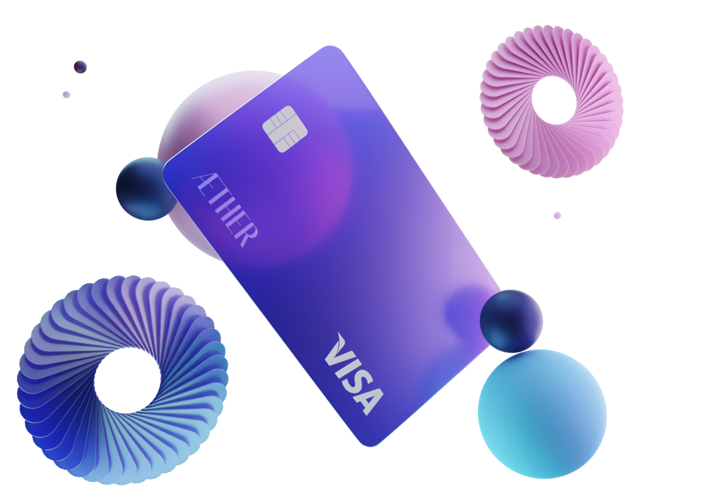
The hard part awaits
Now comes the hardest part of the whole render, material, and lights. These things are tricky on their own, not to mention when you need the illustration to fit your design afterward.
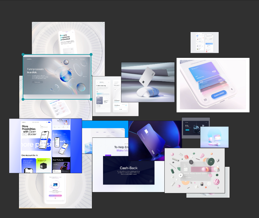
I did over 30 renders until I said STOP! This has to do it.
Below are some failed renders.

Moving on
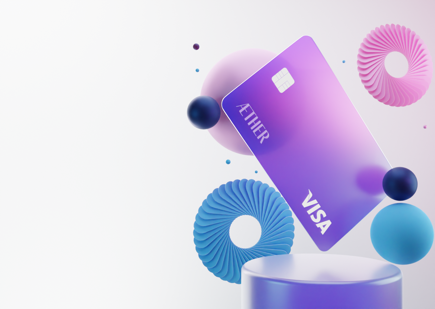
Once I felt like, this might be good enough, I tweaked it a little by little in Figma afterward. You don’t know, how the illustration will look in the design until you try it.
From there, I created another mood board for my 2D design. I had something in mind of course, but it’s always good to look around and find something that inspires you.
You might call me old-fashioned, but Pinterest is my go-to when it comes to mood boards and visuals. I feel like the algorithm is so well made. Not to mention, you can find everything you need there.
Sure, you still need to be cautious with the content there, but Dribbble isn’t much better when it comes to useful designs.
I could have stopped here. The landing page is done, I learned what I wanted from the concept, but hey.. we’re having fun here. So let’s push it a little further
Make it complete
Usually, after the landing page, comes a sort of divider between the main content and what’s about to come. I felt like it would be fun to have a transaction counter paired with partners as a divider.
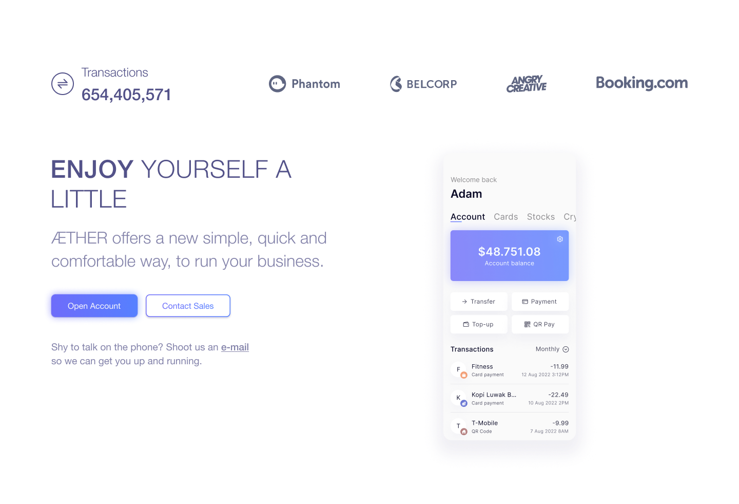
After that, it was very easy for me to fill the space. I had already designed a screen for some sort of mobile banking app, so I put it there with some copy and CTA’s.
Looking at it right now it could use a little kick, it’s a bit empty next to the mock-up. But hey, those are the things you see with a little time away from the screen.
The darkness comes!
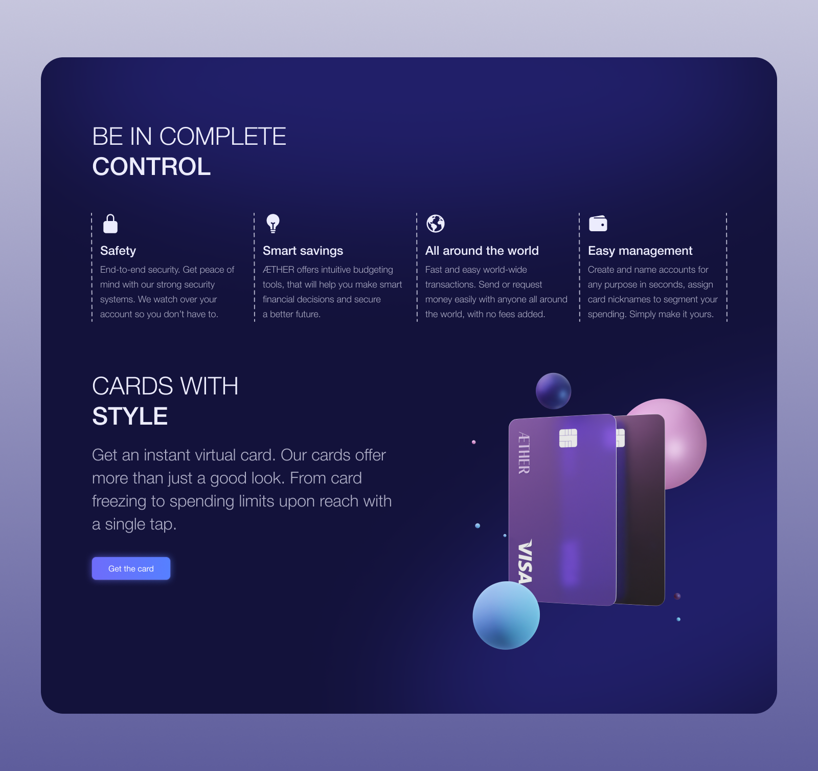
I felt like, there was too much white color. I needed another divider to split the groups and get the user’s attention again. I also went back into Blender and made another 3D illustration, to fill up the empty space and give it some sort of a vibe.
Create, Get feedback, Fix it, Create some more, Get feedback again
I’d lie that this was a final version of the design, before I got to this point I shared the initial idea with a Slack group I’m at. Telling them to go hard on me and tell me what they like and don’t like. Oh boy, I was in for a treat.
Those aren’t even all the comments! More and some more on the Slack thread as well. There were some amazing tips.
„Make the text smaller and adjust the buttons„
„Buttons feels poorly designed and not so trustworthy„
„I would try to fiddle with typography to make it a bit more interesting, tbh it looks kinda bland right now„
„Too much text and poor hierarchy reduce the body color opacity to 64% or 72“
I could go on and on. The important thing is, this helped me push it further. I wouldn’t be able to do it without the feedback from them. So I guess this is me saying thank you.
Thank you guys, for your time and feedback!
I wanted to share this since I feel like people are scared to get criticized, get feedback, and put the work out there. Also, just because you get feedback on the design, it doesn’t mean you have to take all the suggestions.
In the end, it’s your design, but it was very eye-opening and I definitely fixed a ton of stuff from their suggestions.
Didn’t make it in time
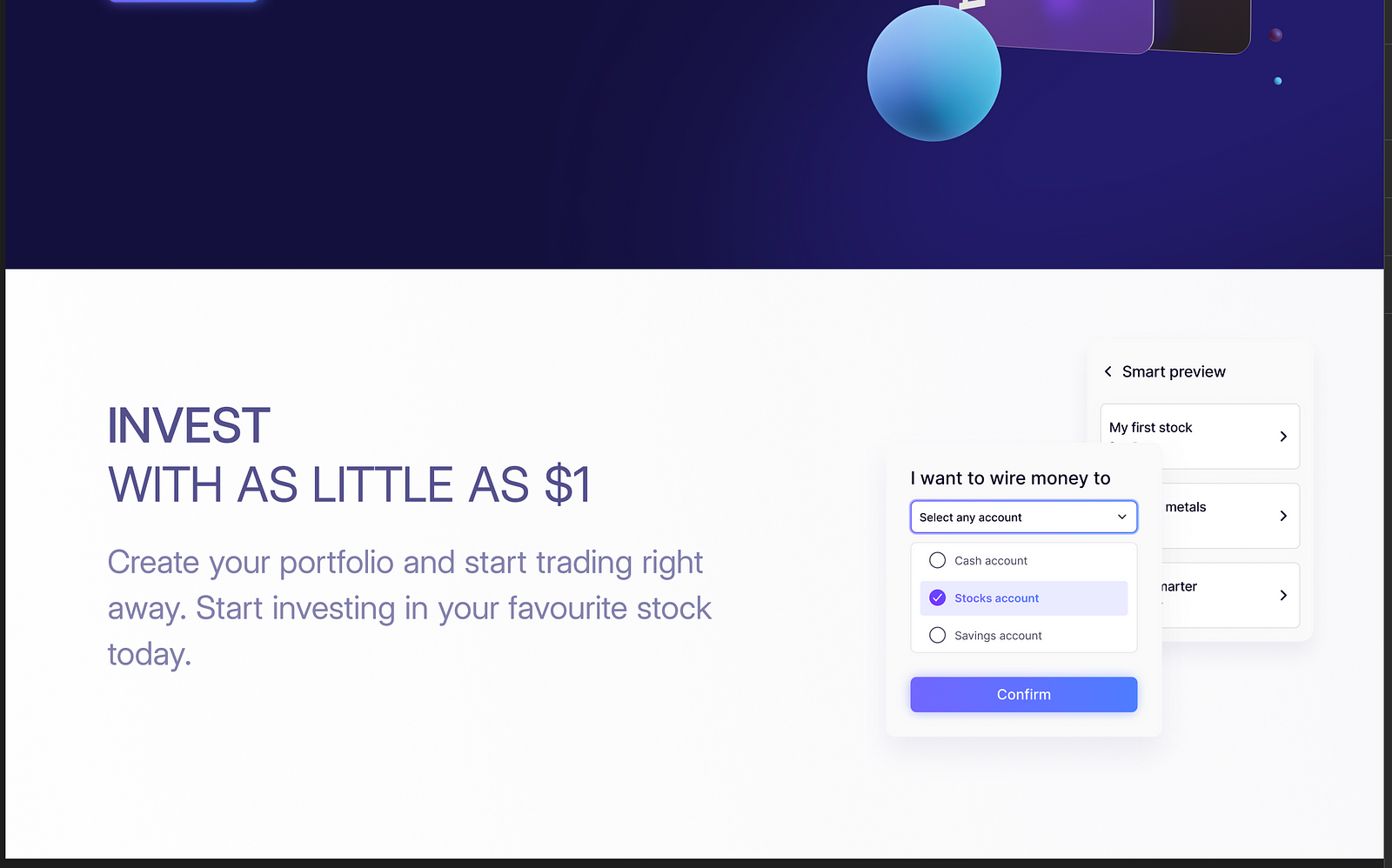
Unfortunately, I didn’t manage to finish it all the way through with one more section and the footer missing.
I try to do these designs weekly, so it means once Sunday ends, I start to work on a new design and try to finish it by the end of the week. This time I didn’t make it, but I’m looking forward to finishing it and sharing it later on with you guys.
Wrapping up
This was another long one. I wanted to keep these short, but I seem to fail. So let me steal a quote from one of the people I follow. The Crazy One, Stephen Gates
„Thank you for your time, I know time is truly the only real luxury we have.“
And that’s it! I wish you all a beautiful end of the weekend and see you at the next one!


